Abstraction
John Suler, a photographer and professor of psychology said in photographic sychology: image and psyche, his essay, "an abstract photography draws away from that which is realistic or literal. it draws away from natural apperances and recognizable subjects in the actual world. some people even say i departs from true meaning, existence, and reality itself. it stands apart from the concrete whole with its purpose instead depending on conceptual meaning, existence and reality itself. it stands apart from the concrete whole with its purpose instead depending on coneptual meaning and intrinsic form... heres the acid test: if you look at a photo and theres a voice inside you that says 'what is it?' ... well, there you go. its an abstract photograph."


The white paper test
For this task I had to take a series of photos of a piece of white paper against a white background, I could shape the paper I whatever way I wanted such as scrunching, folding or rolling it but couldn't cut or tear it. This was shot in a studio with both spotlights and soft lights as well as this I could use colour filters to create an interesting effect, this helped to explore lighting and shadows whilst changing the lighting around for different photos.
My photos
|
|
|
best edits
Tamara Lorenz
For this set of photos I looked at the work of Tamara Lorenz. She is a photographer and her work focuses mainly on abstract photography. Lorenz was born in 1976 in Oberhausen. She got a diploma in 2000 at Dortmund university of applied sciences in visual communication. She completed her postgraduate studies in media art at the academy of media arts in college between 2001 and 2004. Her recent photographers look into the idea of abstract paintings Lorenz focuses on trying to capture abstract photos using folded paper. By using self-assembled, staggered backdrops whilst playing with lights and shadows, she breaks down structural reality in her work.
For this set of photos I looked at the work of Tamara Lorenz. She is a photographer and her work focuses mainly on abstract photography. Lorenz was born in 1976 in Oberhausen. She got a diploma in 2000 at Dortmund university of applied sciences in visual communication. She completed her postgraduate studies in media art at the academy of media arts in college between 2001 and 2004. Her recent photographers look into the idea of abstract paintings Lorenz focuses on trying to capture abstract photos using folded paper. By using self-assembled, staggered backdrops whilst playing with lights and shadows, she breaks down structural reality in her work.
|

|

|
|
|
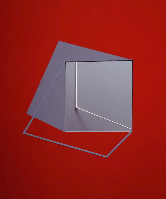
For this set of photos I took inspiration from Tamara Lorenz work. to do this I got lots of different coloured paper, I then folded and cut the paper in different ways to form different shapes. I then placed them against a large piece of white paper using it as a backdrop creating a studio set up for my photographs. i took photos changing around the shapes and colours to make a varied set of photos.
|
best edits
Brendan Austin
Brendan Austin is a photographer and film maker who was born in Hempstead, England on the 8th of January 1999, he is now based in Stockholm, Sweden and balances his time between his commercial projects and his artistic practice. In his work he focuses on exploring the relationship between the human industry and the environment, he has always looked at the industrial landscapes of Europe, this includes aerial work over oil refiners, a nuclear submarine base in Crimea and underground in iron ore mines. he now is embedded with a renewable energy company that is at the forefront of developing a method to harness energy from the ocean
Brendan Austin is a photographer and film maker who was born in Hempstead, England on the 8th of January 1999, he is now based in Stockholm, Sweden and balances his time between his commercial projects and his artistic practice. In his work he focuses on exploring the relationship between the human industry and the environment, he has always looked at the industrial landscapes of Europe, this includes aerial work over oil refiners, a nuclear submarine base in Crimea and underground in iron ore mines. he now is embedded with a renewable energy company that is at the forefront of developing a method to harness energy from the ocean
|
|
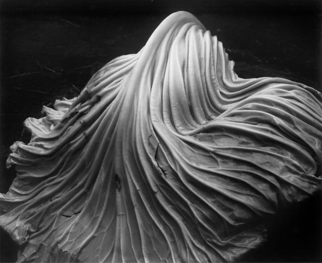
For this set of photos I created a studio set up using white card as a backdrop and then creating lighting with a flash moving it around to create different shadows. I then got different colours of tissue paper crumpling them up and positioning them to imitate mountain like shapes and switches around the colours. For some photos i used a flash and coloured acrylic sheets under the tissue paper to light it up creating a more interesting effect, developing ideas from the photographers work.
Best edits |
Edward Weston

|
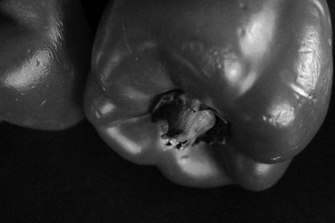
Edward western was an American photographer who was born on the 24th of march 1886 and focuses mainly on a modernist style characterized by the use of a large format camera to create sharply focused and richly detailed black and white photographs. Weston used a Graflex 4x5 camera as well as the 8x10, this allowed him to see the subject matter when taking photos and gave him a good quality image. western had a certain philosophy about photography which was to be very precise and to plan his composition. an issue western encountered when photographing a pepper was difficulty with getting the right depth of field to fix this he made it shorter by making his own F-stop of 240. for his photographs of peppers he used natural light and an exposure of 4-6 hours to get the effect right. however the long exposure affected the image as the pepper would get moved and the exposure would be ruined anytime a car would go past, this meant he would have to stat the whole process from the beginning.
|

|
|

|

|
Edward Weston worked on this pepper for a week, finally he put the pepper in a tin funnel to bring out its contours. To photograph this specific photograph of a pepper 'pepper no.30' weston used f240, a pinhole, because f64 still did not produce an adequate depth of field, using f240 dramatized the image due to the soft chiaroscuro, light to dark. This photographer was one of multiple peppers he photographed in the series. This is a gelatin silver print with the dimensions 19.1cms x 24.1cms and is one of 60 different versions. Photographers' decisions about subject matter are key to understanding motivations underlying the final outcome image, westons beliefs and values are reflected in his work and are values that fuelled his creativity. A personal statement is very clearly made through the mage and he elevates a commonplace to the extraordinary. The three-dimensional form is focused on rather than a flat image this is done through the angle of view weston took the photograph from. The framing of the pepper is tight to the edge of the print so enclosing the form in a deep spatial recess from which the form emerges with pent up energy emphasizing the energy of its previous growth process. Western, although not spiritual by nature, hoped his print would find connections to nature's deep internal rhythms.
|
My photos
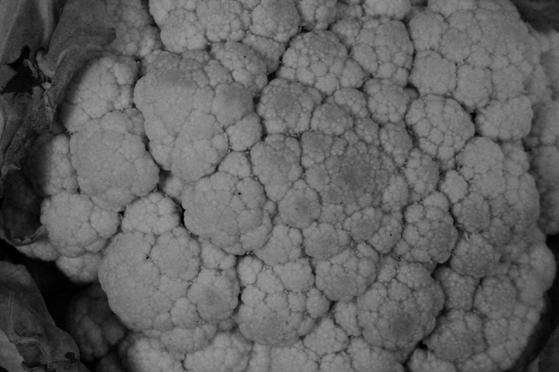
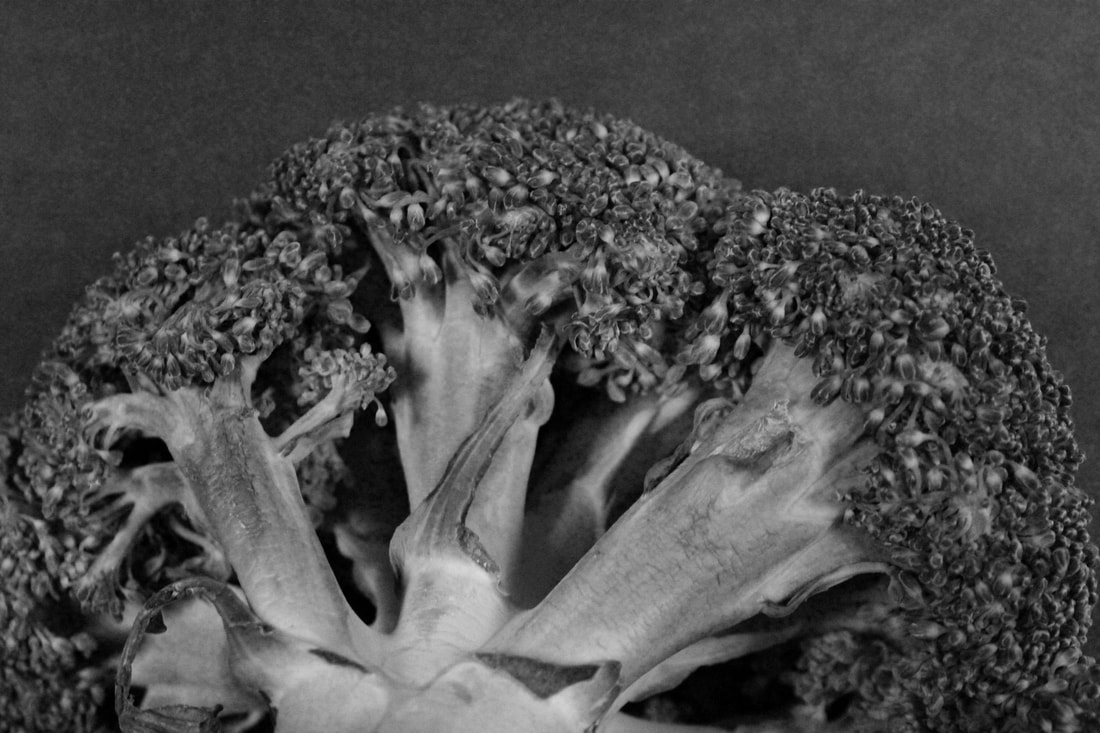
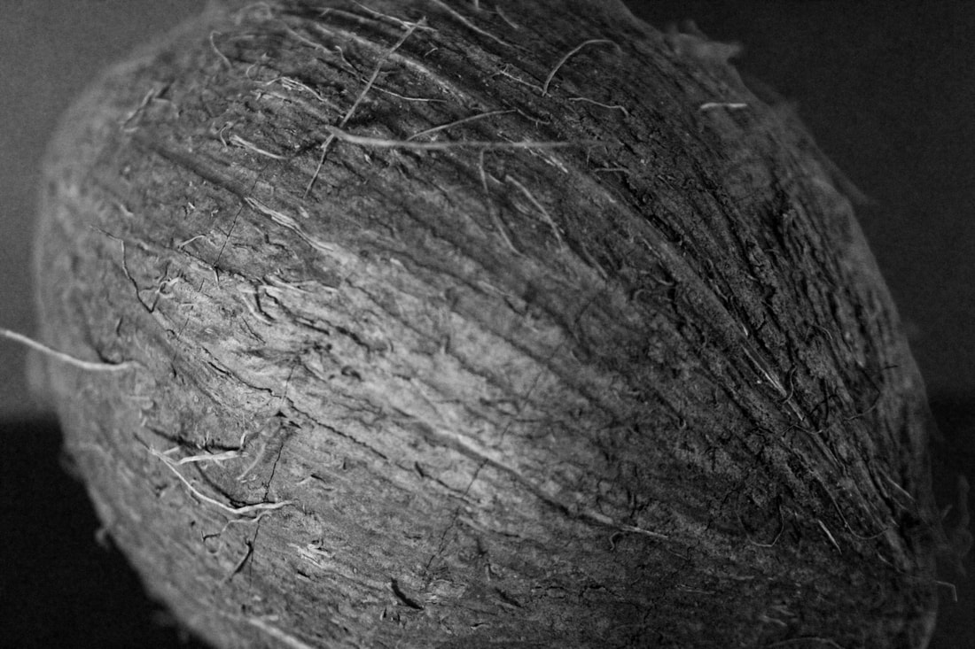
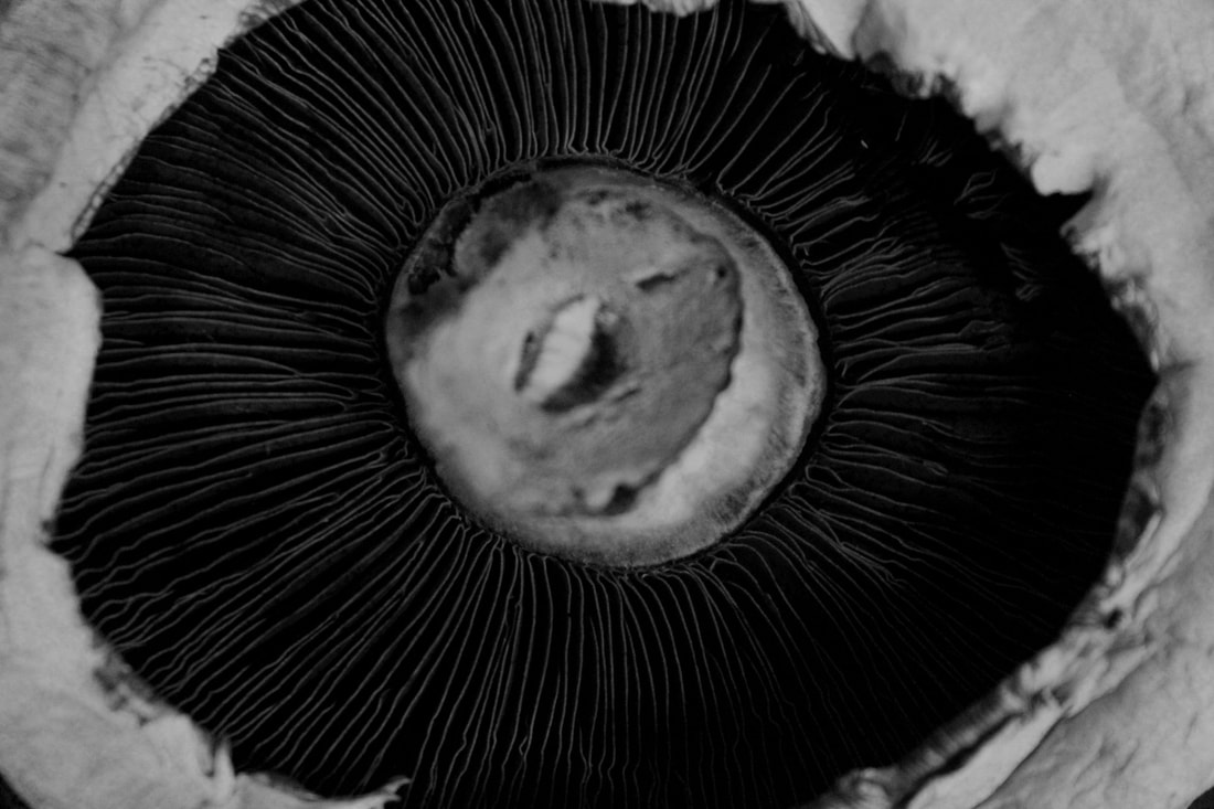
For this set of photos I created a studio set up using black card for a backdrop and used a flash as lighting because it enabled me to create different shadows and cast light on different parts of the subject. I then used different subjects such as vegetables and shells changing the positioning of the object to capture different parts changing around the composition to create more varied images.
For this set of photos I created a studio set up using black card for a backdrop and used a flash as lighting because it enabled me to create different shadows and cast light on different parts of the subject. I then used different subjects such as vegetables and shells changing the positioning of the object to capture different parts changing around the composition to create more varied images.


best edits
Best Edits
|
|
|
|
|
Abstract comparisons: body vs nature
Alicja Brodwicz
"I photograph the human body – the microcosm, Its’ fragments: hair, scars, texture of skin, wrinkles. I am interested in individual particularities; I look for distinguishing features and irregularities. Imperfections are my favourites.”
for this set of photos we looked into Alicja Brodowicz who was born in Kraków and is a polish photographer who focuses on subjective documentary and fine art photography. she graduated from the institute of creative photography in Opava. she has won 1st place in black and white child photo competition as well as being a finalist and laureate of many photography competitions such as IRIS award, Australia. the work that I took inspiration from was her project visual exercises, this involved her finding similarities between nature and humans and showing these findings in her photographs. I used her ideas and photographs as inspiration and I went around taking photos of different things in nature that I thought looked like parts of the human body, then once I had all these photos I created a studio setup and took photos of different parts of the body based on the photos I previously took. I then went on to edit these creating one image with the nature and body side by side to show the comparison.
Examples of her work


|

|
My photos
photo process and best edits
For this breif i went around outside taking photos of things in nature that could resemble body parts. i then took photos of features and body parts that look like the photos of nature that i took.
|
|
|


Abstract portraits.
finish photogrpaher wiritng add examples
Bill Jacobson is an American photographer who was born in 1955 in Norwich, Connecticut. he is widely known for his out of focus, abstract photographs of both the figure and different landscapes. his work is in collections of many museums such as the Guggenheim museum, the metropolitan museum, the Victoria and lots more. as well as this in 2012, he was the recipient of a fellowship from the john Simon Guggenheim foundation. he has received a BA from brown university (1977) and an MFA from san Francisco art institute (1981). towards the mid 1990s, he completed the thought series, which was an almost monochromatic evocation of the flow of life.
Jacobson’s subsequent Song of Sentient Beings continued this interest in the defocused figure. In contrast to the bleached luminosity of his earlier work, this series depicts deep-black backgrounds enveloping ghostly figures, which bend, sleep, stretch and howl.
Towards the mid-1990s, he completed the Thought Series, an almost monochromatic evocation of the flow of life. These depict a broad spectrum of subjects, from tightly cropped faces and articles of clothing, to fields of grass and surfaces of water.


Best edits


|


|


|
photogrpaher writing and examples and process more edits
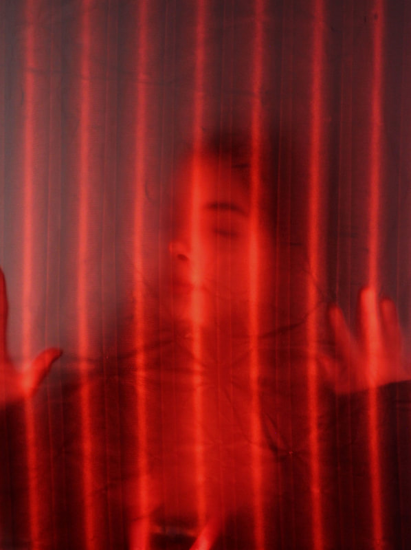
For this set of photographs there was a very specific set up. I used a light to project light onto the setup as well as colours and texture using different types of glass panels. for the setup there was a sheet of baking paper held up by clips attached to a metal frame. this was for the subject to pose behind to create the desired effect. this meant that the light would project the subject behind the paper and create shadows whilst drawing attention to specific parts of the face that are seen through the paper. |


Johnny Kerr - Ambiguity
Ambiguity is a sustained investigation of Antoine Predock's Nelson Fine Arts Center in Tempe, Arizona. Kerr spent hours photographing, waiting and observing how the lines, shapes and forms changed as the sun moved from morning to late afternoon, revealing new relationships of harmony or tension.
The ambiguous forms, shapes and textures of the almost featureless stucco exterior intrigued Kerr as a designer.
By observing how the structural lines intersected from various vantage points, Kerr was often able to confuse the visual perception of foreground and background. The pastel colour palette is inspired by the building’s southwest geography and was a challenging visual departure from my previous monochromatic approach to abstract architecture.


Best edits

|

|
Matthieu Venot - Abstract geometric photography
Matthieu Venet was born
Matthieu Venot started out with a strong desire to rediscover his town of origin, Brest in Brittany and captures it from his perspective.
Focusing his lens on architectural details and adopting fairly constructivist angles, the artist succeeds in creating abstract geometric images. He only photographs when the weather is incredibly good and thus Matthieu uses the immaculate sky like the background in a studio. This, he maintains, is his way of not disturbing the composition of his pictures : simple and graphic. Lines cross over and overlap. shapes stand out from this blue background and have us forgetting what we are observing : a roof, a wall, a railing, a balcony.
The blue sky background also enhances the colours. Colour is, in fact, of the utmost importance in Matthieu Venot's photography. Excluding the Breton greyness, the photographer transforms the town and has us thinking more of California or Florida. According to the artist, the choice of pastel colours is a way of transmitting, through his photos, his own personal optimism.
Artist section
photos i used for edits
photos i used for edits


Editing process
For this task I looked into the work of Matthieu Venot, to create work in the style of this photographer I used my photos from the previous task and chose which ones I thought would work well. I used photoshop and followed this editing process to create the final image.
|
to start of the editing i chose my photo and imported it into photoshop. i then edited it as normal to bring out the colours and make sure the image wasnt wonky etc.
|
after that i selsected the polygonal tool and started gpoing around and selecting different sections of the photo i chose to edit
|
then i went on the dropdown filter and chose blur then average this meant the average colour of the section fills the selection.
|
|
another way you can do it is by going to the drop down edit then fill and select the colour that you want to fill the section this gives you more options and can add to the photo as it can stand out more
|
i did this for the rest of the photo chosing the level of detail i wanted to be used in the photo
|
once i finished filling in all the sections and i was happy with the outcome i got my final product
|
Best edits
Saul Leiter
Saul Leiter was an American photographer and painter born on 3rd of December 1923 in Pittsburgh, America. His early work in the 1940s and 50s was an important contribution to what came to be recognised as the new York school of photography. He focuses on documenting street life using black and white, creating obstructions using blurred movement and details being half hidden to intrigue the eye. In 1992 jane Livingston noticed his work and she decided to include him in her 'New York school' this was a group of noteworthy mid century photographers some of which included, Diane Arbus and Robert Frank and worked with a film noir version of the city. Leiter developed a dreamy and more distinctive style through playing with a vibrant palette and shallow depths of field. People have argued that his photos closely link to his love of painting.
Some examples of Saul Leiters work:


|

|
Stephen Calcutt
Stephen Calcutt is a street photographer who works around the city of Birmingham using scratched up graffitied bus stops and shelters. whilst graffiti can be great art Calcutt feels that being scratched into the plexiglass bus stop windows feels like a violation and feels he is yet to see any of these etchings that look great in their own right. these markings made on the bus stops act as an expression of hate, anger, love or frustration. this is opposite of normal graffiti on buildings which is seen as more grande and colourful the bus stop graffiti is more mundane. the bus stop acts as a lens to look through and creates an interesting abstracted feel to the image. Calcutt create a new perspective that maintains and exaggerates the energy of the graffiti.
Stephen Calcutt is a street photographer who works around the city of Birmingham using scratched up graffitied bus stops and shelters. whilst graffiti can be great art Calcutt feels that being scratched into the plexiglass bus stop windows feels like a violation and feels he is yet to see any of these etchings that look great in their own right. these markings made on the bus stops act as an expression of hate, anger, love or frustration. this is opposite of normal graffiti on buildings which is seen as more grande and colourful the bus stop graffiti is more mundane. the bus stop acts as a lens to look through and creates an interesting abstracted feel to the image. Calcutt create a new perspective that maintains and exaggerates the energy of the graffiti.
Some examples of Stephen Calcutt's work:

|

|

|
Nick Turpin
nick turpin is a british street photogrpaher and an advertising and design photographer who was born in 1969 in london. he is based both in london and lyon, france. the first international collective of street photographers were established by turpin, in 2000 and was a member until 2018.
nick turpin is a british street photogrpaher and an advertising and design photographer who was born in 1969 in london. he is based both in london and lyon, france. the first international collective of street photographers were established by turpin, in 2000 and was a member until 2018.
My Photos
For this task I went around my local area taking photos through bus shelters that were slightly scratched up and graffitied to create an effect similar to the photographers I looked into.
For this task I went around my local area taking photos through bus shelters that were slightly scratched up and graffitied to create an effect similar to the photographers I looked into.


Development two
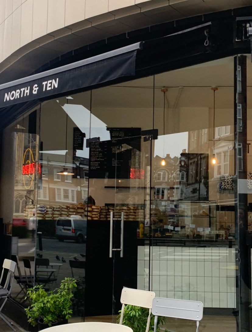
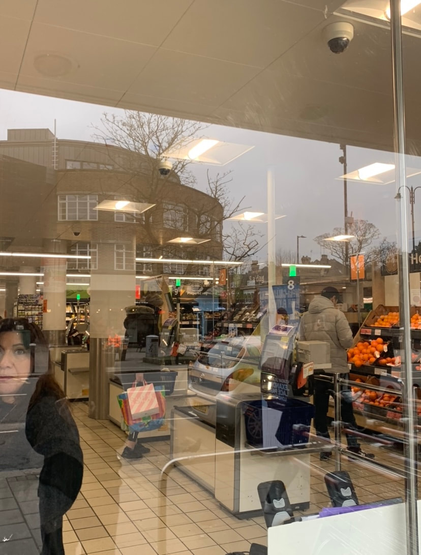
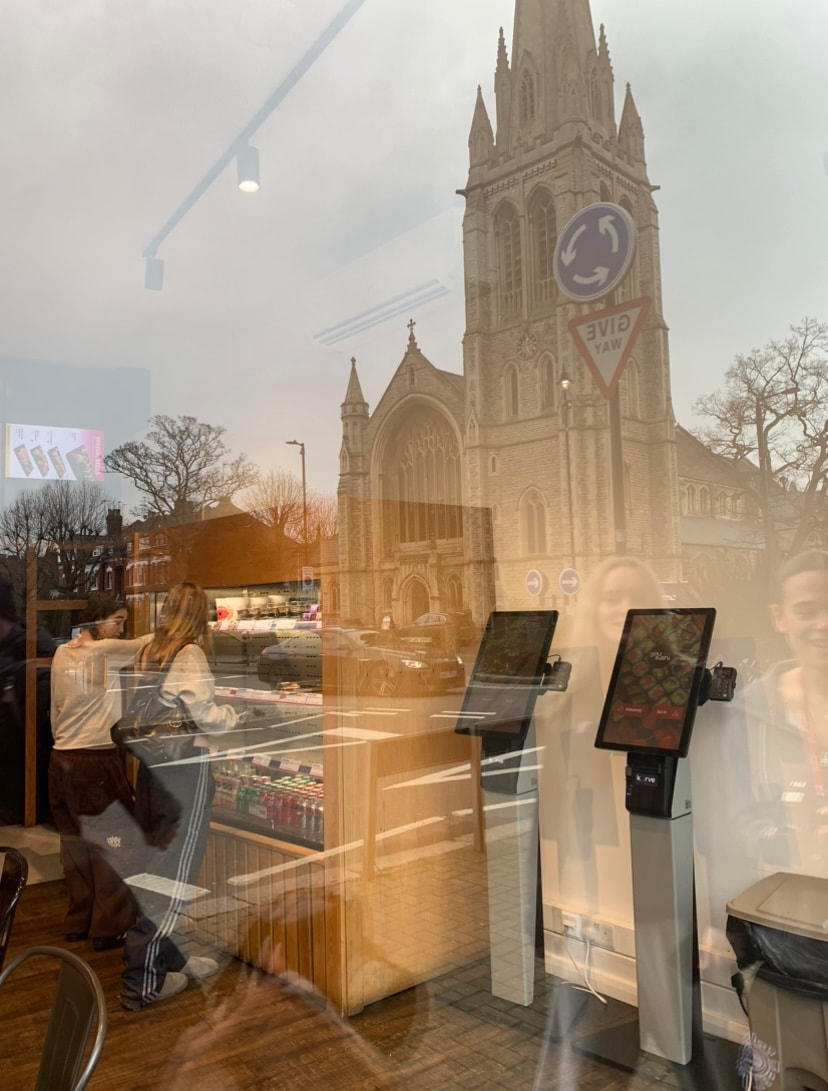
For this development I walked around my local area and took photos into shop windows this was to catch the reflections of people in the glass whilst also catching people of things inside the shop. This created an effect of abstraction as the original view into the shop is being obscured by the reflections from outside the shop.
For this development I walked around my local area and took photos into shop windows this was to catch the reflections of people in the glass whilst also catching people of things inside the shop. This created an effect of abstraction as the original view into the shop is being obscured by the reflections from outside the shop.


Best Edits

|

|

|

|

|

|
Independent development
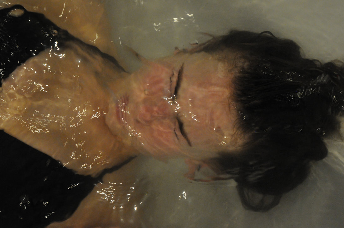
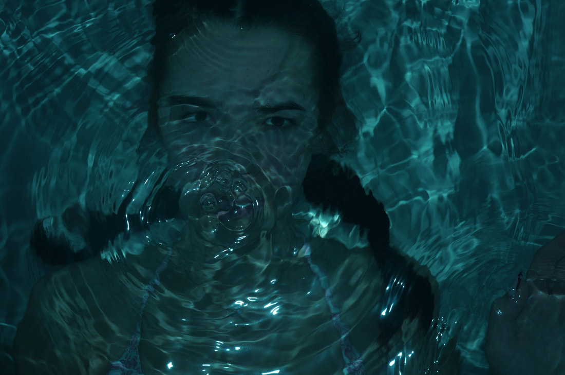
Strand one
For this strand I was exploring abstraction through water, I had a model posing in a bath with their face underwater this meant they had bubbles and ripples over the face causing there to be an abstracted effect. I also used a flash with colours to make the photos more interesting.


|

|
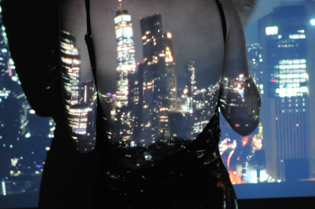
Strand two
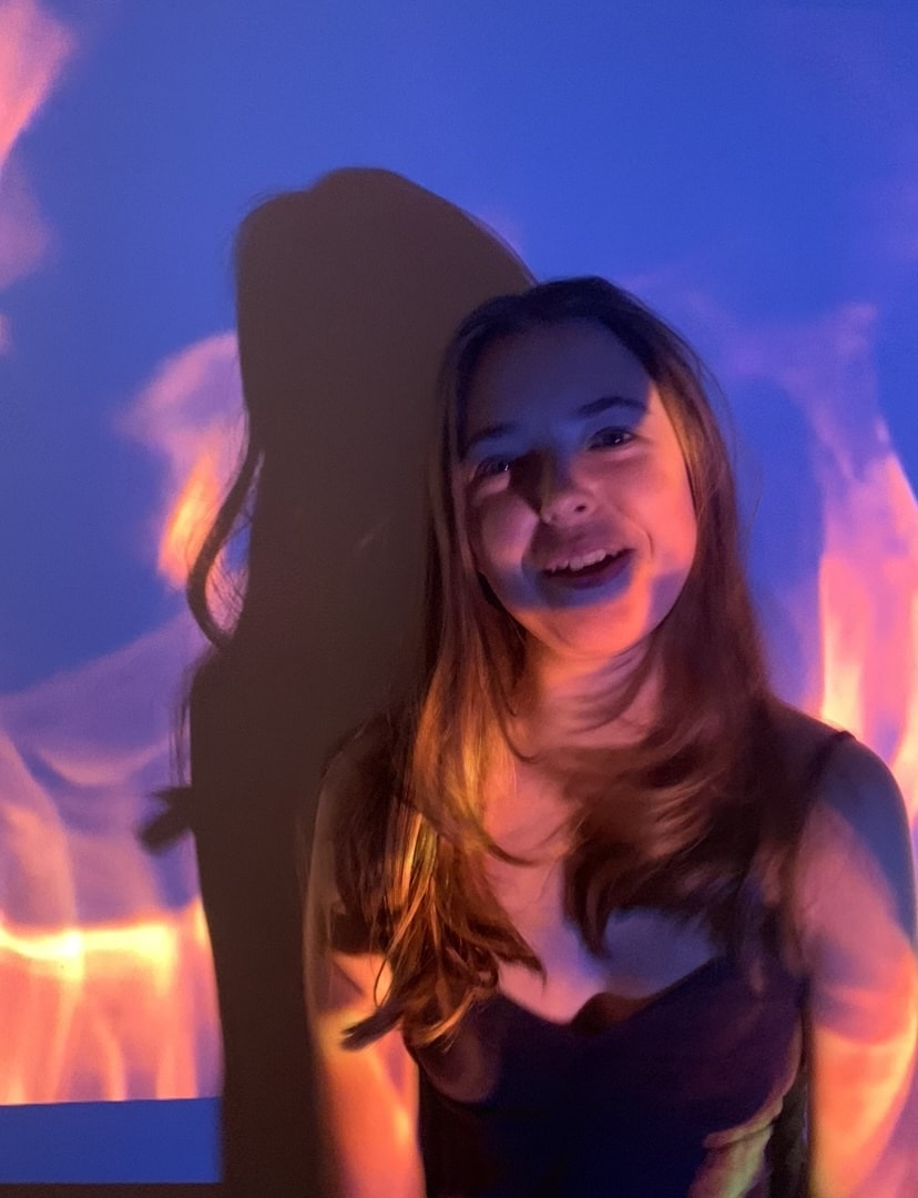
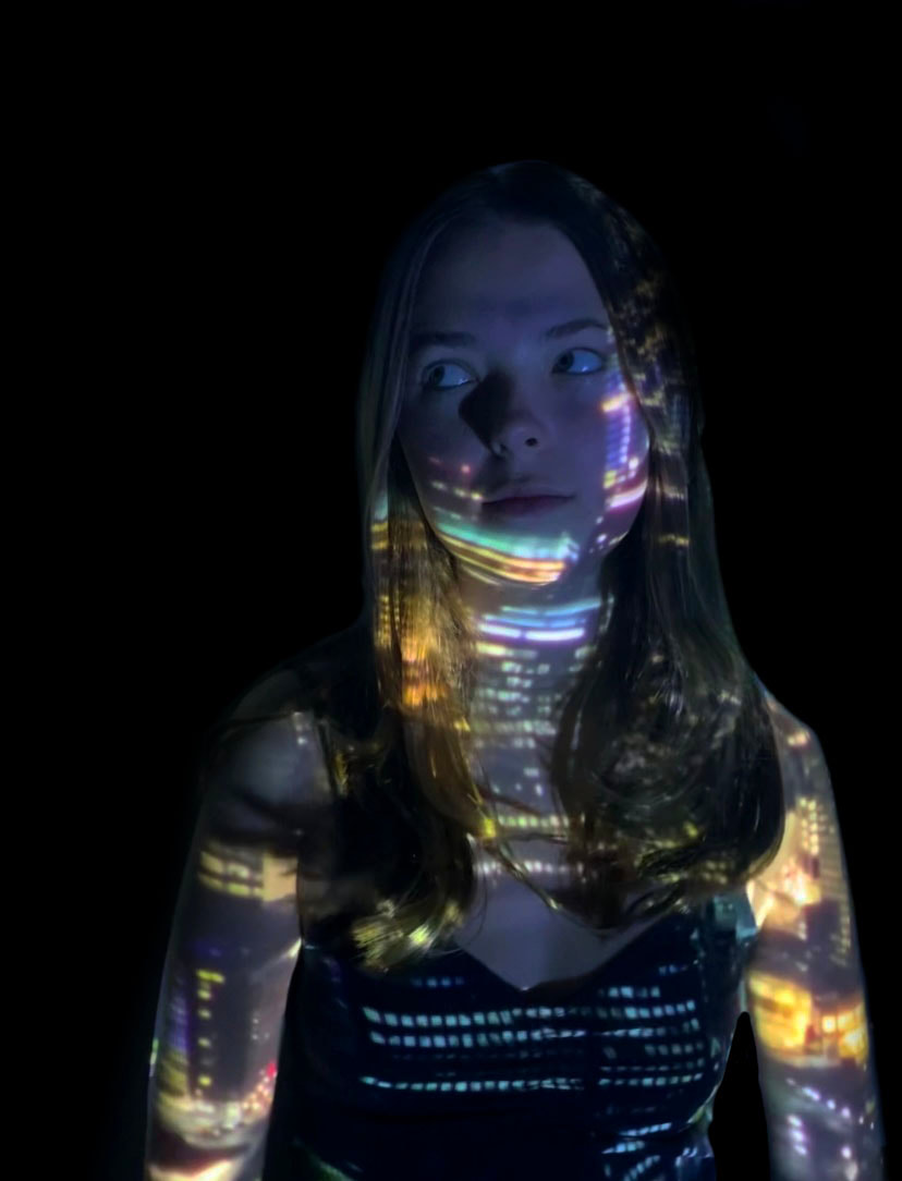
For this I wanted to look into projections, for these photos I set up a projector finding different patterns to project over the model and changed it to create more varied photos. I got the subject to move so I could capture different angles as well as using different compositions throughout.


development one
For this is wanted to develop my projections strand so I used more patterns to have more images and looked into editing them in a different way.


|

|

|
